
The idea was to make a website look like something real (pieces of paper on a cutting mat). I have some technical requirements:
- SUCKLESS. No Javascript. Minimal CSS (<300sloc). Minimal HTML template (<100sloc).
- Load fast (so, need to convert images to compressed webp)
- Be relatively painless to edit pages (either trivial HTML, or use a templator)
- If using a templator, make the template as simple as possible so you’re not looking in 20 different places to try and change something
I really like the ideas of this better website - but I need images, too, and I want to display a crafty look. So… some more CSS is needed. Between needing to resize images, and the prototype HTML for the look I want being clunky, I needed to use a static site generator. I’ve used many over the years and what I like best is Hugo. Why? Honestly, because it just works - setup is a breeze.
GitHub Repo
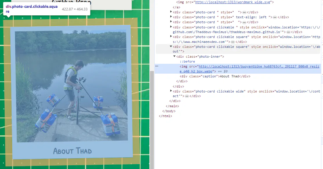
Everything is built around this core idea of a ‘card’. You put multiple cards together to build a page, kinda. The HTML structure is like so:
<div class="photo-card {extra classes}" style="{extra styles}" onclick="window.location='{href}'">
  <div class="photo-inner">
    <img src="{url}">
    {optional raw HTML snippet}
    <div class="caption">{caption}</div>
    {additional body}
  </div>
</div>
So, there’s a lot of parameters for each card! It seemed like the best way would be to structure posts entirely in the front matter of documents (and I like YAML). So, for instance, this page looks like: [File: content/index.md]
---
title: 'This Website'
date: 2023-10-12
draft: false
layout: collage

wrapper_classes: "mw2"
cards:
  - body: >
      This website was built with Hugo using a custom theme. I'm particularly inspired by the great work of [Van Neistat](https://www.youtube.com/channel/UC5mPJA4y5G8Z6aNkY6AxgAw) and [Tom Sachs](https://www.tomsachs.com/).

  - body: >
      The idea was to make a site look like something real, but with a few requirements:

      - If using a templator, make the template as simple as possible so you're not looking in 20 different places to try and change something
    styles: "text-align: left"
---
Each card can have the following fields, all of which are optional:
href: where the card should link tocaption: a heading for the cardbody: a body for the card, in markdownimg: url of the image to be displayedstyles: a CSS snippet to apply to the card. (text-align,max-width, andwidthare particularly helpful)classes: a set of CSS classes to apply to the card (square,wide, andtallwill modify the aspect ratio of the internal image)resizeq: override the resizing for theimg(default iswebp 1000x q40; see the Hugo Resize documentation)
themes/layouts/_default/collage.html
I now understand the hugo templating system a bit better…
{{ with .field }} creates a block where any reference is based on .field; so that:
{{ with .field }}
  {{ .subfield }}
{{ end }}
is identical to:
{{ .field.subfield }}
and the use of $ brings you back to the root of all variables.
resources.Get will get a particular resource (like a page, or image). This is particularly useful with the resizing functionality:
{{ with resources.Get .img }}
  {{ with .Resize "webp 1000x q40" }}
    <img src="{{.Permalink}}">
  {{ end }}
{{ end }}
| default is a useful construct:
{{ .header_img | default $.Site.Params.default_header }}
I think so! As of this writing:
- There are two HTML templates:
baseof.htmlfor the scaffolding (headers, css, and the like) andcollage.htmlfor the actual content. Together they are 77 lines. - There is one CSS file
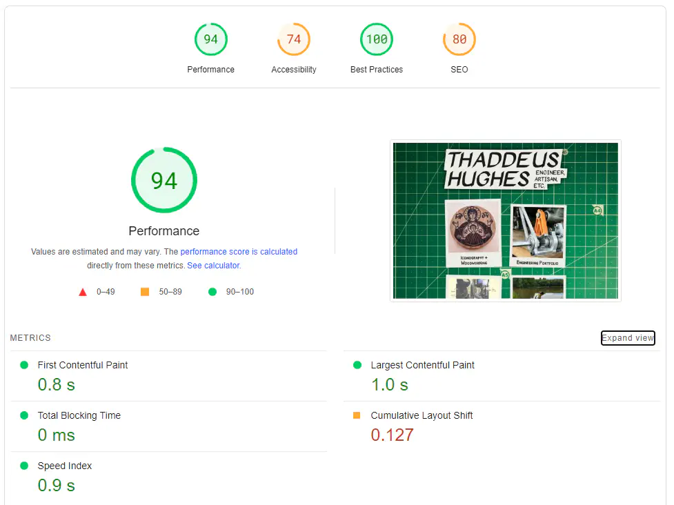
main.css(aside from Google fonts) and it is 214 lines. - Main page loads in under a second - great for something that is primarially images.
- This is the happiest I have been with the look and feel of a website yet.
- This is the easiest editing experience of a theme I have had, by a longshot (I mean, everything I care about is in a few config files and <300 lines of HTML/CSS).
- There is interactivity and interesting visual effects that look heavyweight, but are actually simple and lightweight.
class and style fields to the cards. When’s the last time you saw a static site theme that gave you such controls? To me, the beauty of static sites is that you can risk “injection attacks” - shouldn’t we open these avenues up for the content-makers (ourselves) to further tweak the look and feel of pages? I think that’s a blog post in the making…